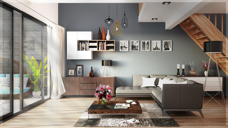
Good interior designing involves a perfect blending of aesthetics and functionality, storage and space. The most well-known designers always keep up with the personalized idea at the center of their mind. It is all about thinking out of the box and to satisfy the needs of a customer. The best interiors should be such that one must always feel great waking up to it.
So, in order to have a mind-blowing interior that is well designed and organized, the interior designer has to make the use of 6 principles of Design. They are as under:
- Balance
- Harmony
- Proportion
- Emphasis
- Movement
- Similarity/Contrast
1) Balance
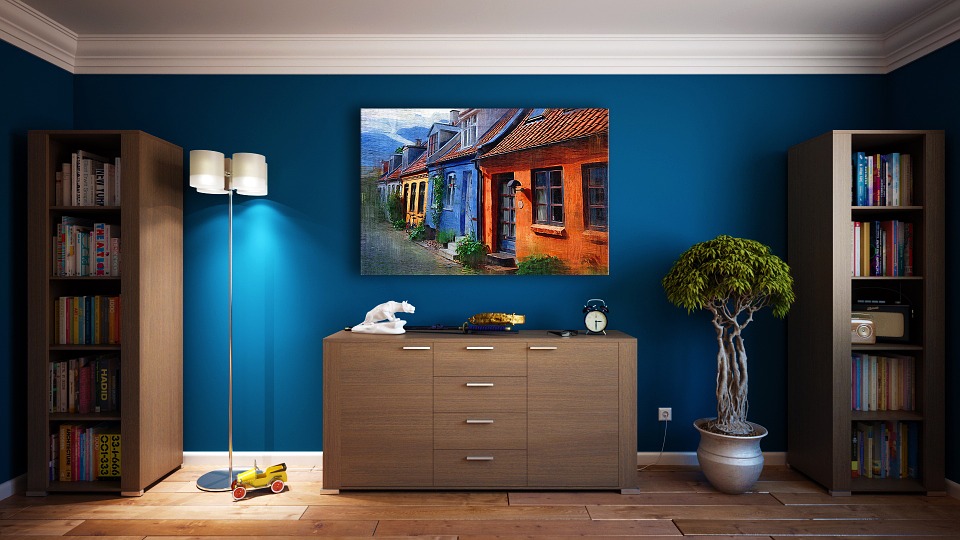
It is all about maintaining the equal distribution of the designs and your ideas in the field of your work area. It is all about the distribution of the visual weight on either side of the horizontal or vertical axes. The balance should be maintained in such a way that when a person is looking for the interiors, then he should not be distracted by any of the specific things but there should be a continuous flow. Balance can be symmetrical, asymmetrical or radial.
2) Harmony
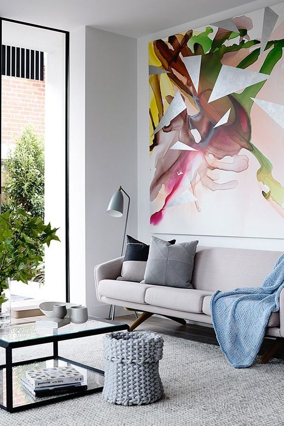
Here we talk about unity and the rhythm in the working of the interior. The elements of design such as line, color, objects, size, and direction; all of these should work in a harmonic motion to make a well-versed design that you are interested in. Unity can be observed by proximity, similarity, continuation, repetition, and rhythm. One may work on the objects or design individually but all the components may come together to provide the harmony.
3) Proportion
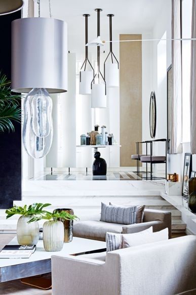
This includes all about scaling, maintaining ratios and the divisions to work upon. The size of the elements should be in a relationship with each other which should provide a classic view to the eyes. This principle goes hand in hand with balance. Individual components hold their own importance but when the elements are used by keeping a specific ratio, it will provide an overall balance to the interior. The divisions create a focal point that will give a sense of direction and maintain the scale and ratios.
4) Emphasis
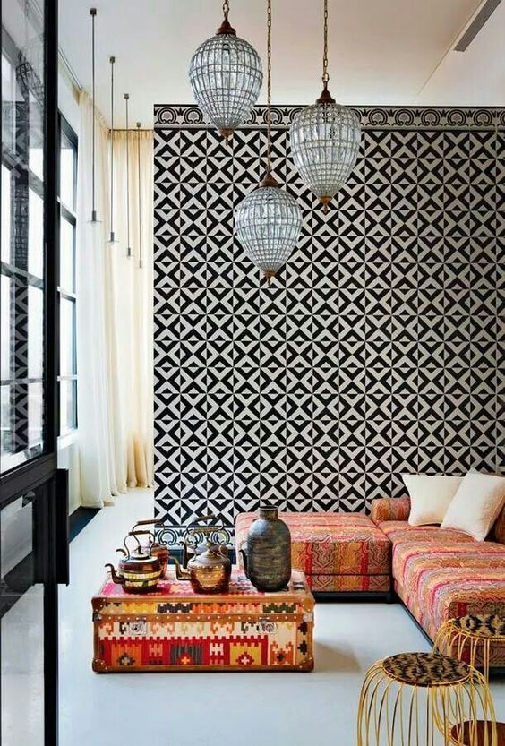
This principle talks about capturing the heart of a viewer. This principle comes into the picture when you want to highlight any particular portion or part of your work significantly when you want to stand out among the rest of your design or want to dominate a particular part. It should be used such that when your work is been viewed this area should highlight all your hard work and efforts and tells the whole story.
5) Movement
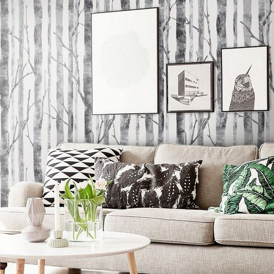
It is the path or hierarchy pattern developed and directed by shapes, lines, and weight. Usually, a tree pattern or by varying weights, this principle can be added. Movement is the flow of your artwork and it is the pattern or fold followed by the eyes of the viewer. The movement of the design can easily be determined by creating a hierarchy of content in a myriad of ways.
6) Similarity/Contrast
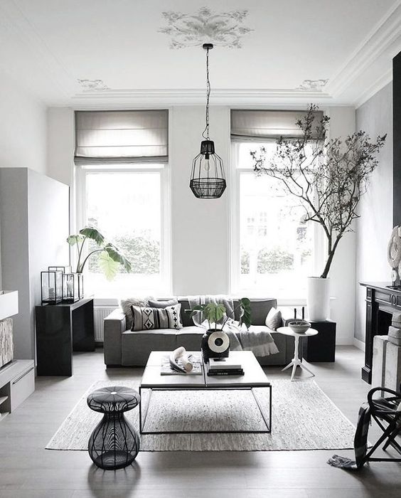
This is the key principle to be added in mind while working on your design. By using the light and dark background and foreground colors, the contrast and the separation can be created between the elements. Using a similar color at many places may give rise to a blending like an appearance so by using the different forms and textures we may need to try to create a contrast.


This is a great article. It gave me a lot of useful information. thank you very much.
Thanks for sharing.
Each and every designs looks so beautiful and really fantastic. Each have different and unique styles. Best ideas I gathered from this blog. Thank you.